A MATTER OF CONTRAST
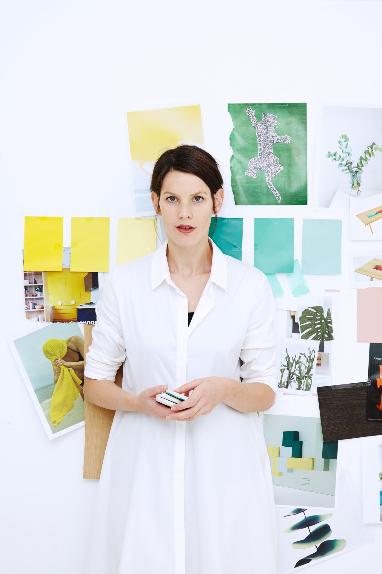
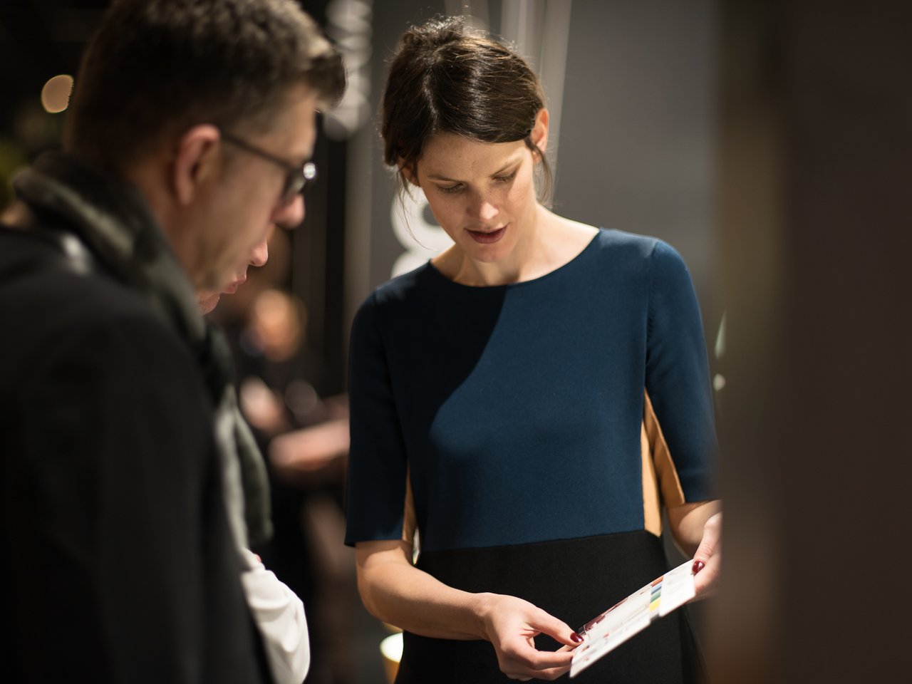
Interview Gesa Hansen
Exciting colour highlights from the lobby to the bathroom? Gesa Hansen explains in this interview why it is fine for hoteliers to be bold in their use of colour and how colours in architecture and design influence the feeling of wellbeing for individuals and society as a whole.
Ms Hansen, what is your personal favourite colour and why?
Oh, it’s difficult to name a firm favourite. Probably green, because it reminds me of nature. But my preferences change every year. At the moment I love Yves Klein’s blue, which Le Corbusier also used a lot in his architecture. This is no plain blue - its luminosity is incredible and it makes me feel as if I could immerse myself in the colour. My answer shows how colours are an expression and reflection of one’s personality.
Your example illustrates how, in architecture and design in particular, colour can be an expression of a prevailing mood throughout society. Just take the Golden Fifties...
That’s right. The 1950s were an incredibly optimistic time. The economy was booming, and this optimism was also reflected in fashion and design. There were numerous theories about colours at this time: turquoise was considered to be a calming colour capable of bonding families, for example. Overall, colours remained very close to pastel during this time. This fitted in with the 1950s housewife, who found bliss within the four walls of her suburban home. In contrast, the 1960s brought much louder, flamboyant colours to the fore. This was a rebellion against the prissy colours of the fifties, much in the same way that the young women in mini-skirts unravelled the image of the dutiful housewife. But let’s look forward. Isn’t it fascinating how car makers correctly forecast the colours that will be popular in years to come when designing their model lines?
What conclusions does that allow about our society today?
We attach ever more importance to personality. How do we demonstrate this through colour? We are moving away from the era of grey shades and towards gentle new tones - not as garish as in the 1960s.
So the moods of the times through which we live are always changing. What does this mean for companies such as Villeroy & Boch? How do you go about developing colours, colour patterns and collages?
The secret or the challenge is to create contrasts. Emerging as we are from this “black/white/grey era”, it is easier to use gentle colours, which possess an almost textural quality. They are not perceived as disturbing colour content. The simplest way to use colours is to work with shades of the same colour, in order to create gentle contrasts.
Colours are never actually perceived as colour per se, however, as the body accustoms itself to the colours around it. After a while, both the child and the mother will become oblivious to the colour in an all-pink child’s room. To really bring colour to life, you have to create contrasts with different colours, in order for the colours to continue to make an impact on the beholder. A case in point is the Artis collection from Villeroy & Boch: all the colours here are inter-combinable, allowing collages to be developed on the basis of this spectrum.
Mobility is integral to the trend towards individualisation. How can people’s wish to enjoy their favourite colour in any surroundings be accommodated in hotel design?
Personally, I think it is much more interesting to be surprised when I’m on my travels. At home, one would never use colour with the boldness displayed in a restaurant or hotel. As we do not take up permanent residence in such places, very colourful combinations appear refreshing, rather than garish. So I wouldn’t even attempt to take up customers’ favourite colours, preferring rather to surprise them with exciting colour combinations.
About the interviewee:
German/Danish designer Gesa Hansen was born into a family of furniture designers and architects. After studying at the Bauhaus University of Weimar and working for Jean Nouvel, the Paris-based designer established the “The Hansen Family” label. Gesa Hansen has developed an exclusive colour concept for Villeroy & Boch.