The “His & Hers” bathroom concept – convergence or contrast?
In conversation with designer Gesa Hansen
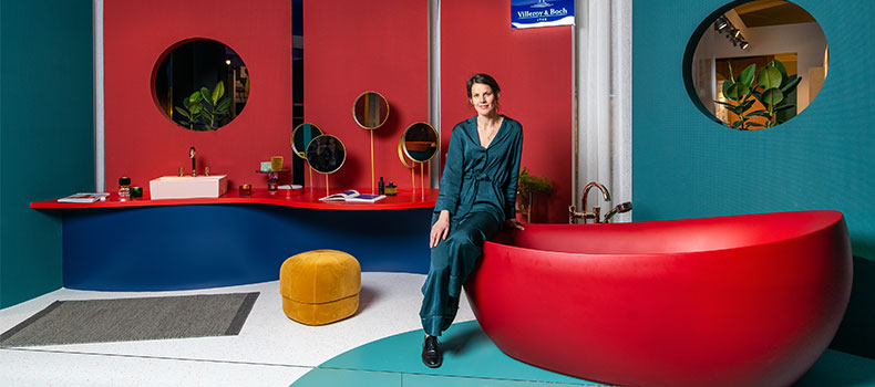
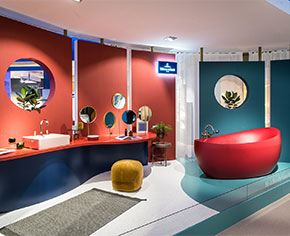
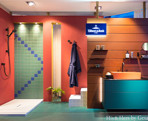
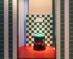
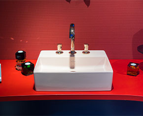
Against the backdrop of gender discussions and equality, the designer Gesa Hansen, who has been working with Villeroy & Boch for several years, has turned her attention to “men’s and women’s bathrooms”, including aspects of colour blocking. This resulted in the “His & Hers” bathroom concept that was shown as an artistic installation at Villeroy & Boch’s booth at the ISH 2019 trade fair in Frankfurt .
|
Ms Hansen, what was the idea behind “His & Hers”?
“His & Hers” is all about differences and similarities, convergence and contrasts, men and women, masculinity and femininity – and if and how all that is reflected in the bathroom.
And how is that expressed?
“His & Hers” illustrates the small differences in men's and women’s bathroom rituals – without advocating a rigid separation. Because what at first may seem completely different, is often not that dissimilar. On the whole, I think that there are more similarities than differences.
So, in your opinion, there’s no such thing as men’s or women’s bathrooms? Yes and no. I can’t give you a black-and-white answer. When it comes to colours, there are so many similarities that a woman can also feel at ease in “his” bathroom and vice versa. But when it comes to the atmosphere and furnishings, men and women do tend to have different priorities.
For me, the colour concept is a manifestation of individuality. Ultimately, it’s not the colours themselves that differentiate between male and female, but rather their composition and dosage. I applied all the colours for “His & Hers” extensively and then let them interact with each other to create an effect. |
Are there typical masculine and feminine colours for you? There are, but very few. For instance, pink is a strong feminine colour, which I didn’t want to withhold from “Hers” and so added it as a colourful highlight. Bold greens, reds and blues feature in both “His” and “Hers”. However, I did vary the look of the colours: “His” darker, “Hers” warmer.
How would you sum up “His & Hers”?
“His & Hers” is an artistic projection, which combines colour concepts with interior design, while revealing male and female characteristics. The colour concepts work for both men and women, there are small differences when it comes to furnishings. Nonetheless, for me, “His & Hers” is a call for equality and similarity.
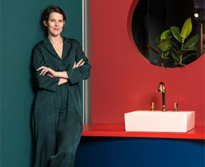
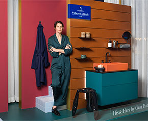
About Gesa Hansen Gesa Hansen was born into a family of furniture designers and architects in 1981. After graduating from the Bauhaus University in Weimar and the Nagoya University of Arts, Gesa Hansen worked for several design studios in Tokyo and Paris – the latter her current adopted home. In 2009 she followed the family tradition and set up her own label, "The Hansen Family", for hand-crafted furniture influenced by Scandinavian design, which immediately received two Red Dot Awards and the Good Design Award from the Chicago Athenaeum. Together with Pascaline Feutry and Aï Bihr, she founded interior design studios in Paris and New York in 2011, which enjoy worldwide success. In 2015, Wallpaper Magazine named Gesa Hansen one of the 200 most important designers in the world. |